OVERVIEW
The Humanitru Dashboard is your organization’s home base — a fully customizable view that surfaces the fundraising metrics, activity feeds, and reports most relevant to your role. This guide walks you through every element of the Dashboard so you can navigate it confidently and configure it to work for you.
WHEN TO USE THIS GUIDE
Use this guide when you are logging into Humanitru for the first time, when you want to set up your Dashboard with the widgets most useful to your role, or when you want to understand what each Dashboard element shows and how to configure it. It is also helpful when you want to share specific Dashboard views with other staff members on your team.
STEP-BY-STEP INSTRUCTIONS
Part A: Access the Dashboard
Step 1. Log in to Humanitru at your organization’s Humanitru URL.
Step 2. Click the Dashboard icon — the circular clock-face icon at the very top of the left navigation bar, labeled DASHBOARD. This is the first icon below the Humanitru logo (the green “H” square in the top-left corner).
Step 3. The page titled “Your Dashboard” will load. This is your personal dashboard view — each staff member has their own dashboard configuration that only they can see and edit (unless a widget is shared).
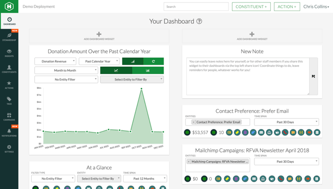
The Humanitru Dashboard — two-column widget layout showing the Chart Widget (left) and Note Widget (right), with the left navigation bar.
Part B: Understand the Dashboard Layout
The Dashboard is organized into a two-column layout. Each column can hold multiple widgets stacked vertically. At the top of each column, you will see a gray “+ ADD DASHBOARD WIDGET” button — this is how you add new widgets to your dashboard. Below each button, your existing widgets appear in the order you have arranged them.
The left-side navigation bar (the dark green vertical bar on the far left of the screen) gives you quick access to all Humanitru modules: Stewardship, Insights, Constituents, Actions, Tags, Campaigns, Notifications, and Settings. Modules marked with a “NEW” badge (shown in orange) have received recent updates.
Part C: Add a Widget to Your Dashboard
Step 4. Decide which column you want to add a new widget to (left or right).
Step 5. Click the “+ ADD DASHBOARD WIDGET” button at the top of that column. A dropdown menu appears with six widget type options:
List Widget — Displays a filtered list of constituent actions (e.g., all recent donations, all overdue follow-up tasks).
Chart Widget — Displays a line or bar chart of donation trends over a selected time period.
Stats Widget — Displays a summary showing total dollar amount, number of actions, and number of constituents — filterable by entity, tag, or action type.
Entity Widget — Shows a filtered snapshot of activities associated with a specific entity (e.g., a tag group or contact preference).
Notes Widget — A free-text notepad for leaving reminders or communicating with team members you share it with.
Reports Widget — Embeds a pre-built report from the Donor Insights module directly on your Dashboard.
Step 6. Click the widget type you want to add. The widget will appear on your dashboard immediately, ready to configure.
Part D: Configure a Chart Widget
Once a Chart Widget is on your dashboard (e.g., the default “Donation Amount Over the Past Calendar Year”), you can configure it using the controls within the widget:
Step 7. Use the first dropdown (default: “Donation Revenue”) to select what data type to chart.
Step 8. Use the second dropdown (default: “Past Calendar Year”) to select the time span. Options include ranges such as Past Calendar Year, Past 12 Months, and Past 30 Days.
Step 9. Use the third dropdown (default: “Month to Month”) to choose how data points are grouped — by month, quarter, or week.
Step 10. The two green icon buttons to the right toggle between a line chart and a bar chart view. The circular arrow button refreshes the chart data.
Step 11. Use the “No Entity Filter” and “Select Entity to Filter By” dropdowns to narrow the chart to a specific campaign, fund, or tag group.
Step 12. The chart updates automatically each time you change a dropdown selection.
The Chart Widget showing Donation Revenue over the Past Calendar Year. Use the dropdowns to configure the data type, time span, grouping, and entity filter.
Part E: Read the “At a Glance” Stats Widget
The “At a Glance” Stats Widget displays six high-level summary metrics: Total Donated, Donors, Verified Donations, Overdue Donations, Average Donation, and Largest Donation.
Step 13. Use the “Filter Type” dropdown (default: “No Entity Filter”) to narrow results to an entity type such as a campaign or tag group.
Step 14. Use the “Entity” dropdown (default: “Select Entity to Filter By”) to choose the specific entity once a filter type is selected.
Step 15. Use the “Time Span” dropdown (default: “Past 12 Months”) to set the date range for all six metrics shown.
Step 16. The row of colored circular icons below the dropdowns represents action types. Click any icon to filter stats by that action type. To select only one type, use cmd-click (Mac) or ctrl-click (Windows) on that icon. Click it again to deselect.
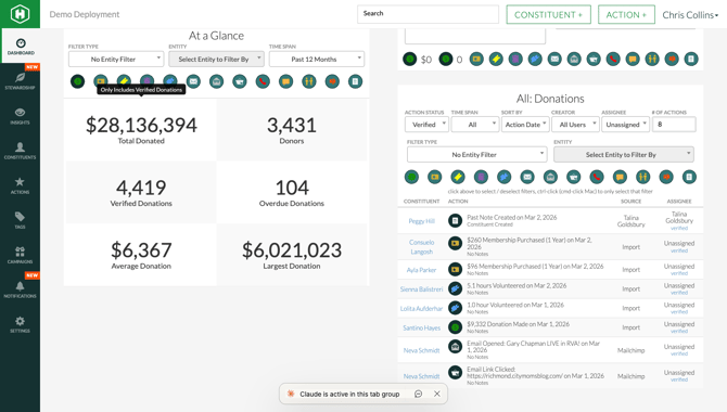
The “At a Glance” Stats Widget showing six key fundraising metrics. Use the Filter Type, Entity, and Time Span dropdowns to narrow results, and click the colored action type icons to filter by specific activity.
Part F: Share or Remove a Widget
Each widget has two icons visible when you hover over it:
Step 17. Share icon (upper-left corner of the widget — an arrow pointing up-right): Click this to share the widget with another staff member so it also appears on their dashboard. This is especially useful for the Notes Widget to leave team-wide reminders.
Step 18. Trash icon (upper-right corner of the widget): Click this to remove the widget from your dashboard. No data is deleted — only your personal dashboard view changes. You can always re-add the widget by clicking “+ ADD DASHBOARD WIDGET” (you will need to reconfigure any filters).
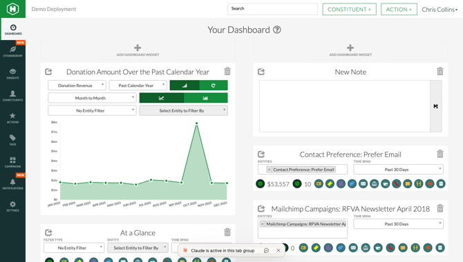
When you hover over any widget, two icons appear: the Share icon (upper-left) to push the widget to another staff member’s dashboard, and the Trash icon (upper-right) to remove it from your own view.
PRO TIPS / COMMON MISTAKES
Pro Tip — Build your Dashboard by role. Development Directors get the most value from a Chart Widget (donation trends), a Stats Widget (At a Glance summary), and a List Widget filtered to recent or overdue donations. Executive Directors benefit from a Stats Widget and a Chart Widget set to “Past Calendar Year.” Data Specialists may prefer a List Widget filtered by action type to monitor recent imports and data changes.
Pro Tip — Your Dashboard is personal. Changes you make to your dashboard do not affect any other staff member’s view — unless you use the share icon to push a specific widget to a colleague.
Common Mistake — Forgetting the time span filter. The “At a Glance” widget defaults to “Past 12 Months,” which may not align with your organization’s fiscal year. If your fiscal year runs July 1 to June 30, manually adjust the Time Span dropdown to get accurate year-to-date totals.
Common Mistake — Accidentally removing a widget. If you click the trash icon, the widget disappears immediately with no confirmation prompt. Don’t worry — no data is lost. Simply click “